Layout Designer
The Layout Designer is the visual editor for Layouts. You compose the document from blocks, bind data with Handlebars placeholders, and check the result against sample data while you work. The editor is built on GrapesJS and extended with tSM components for data binding, conditions, repeating tables and PDF page layout.
Open it from Output management → Layout, then create a Layout or open an existing one.
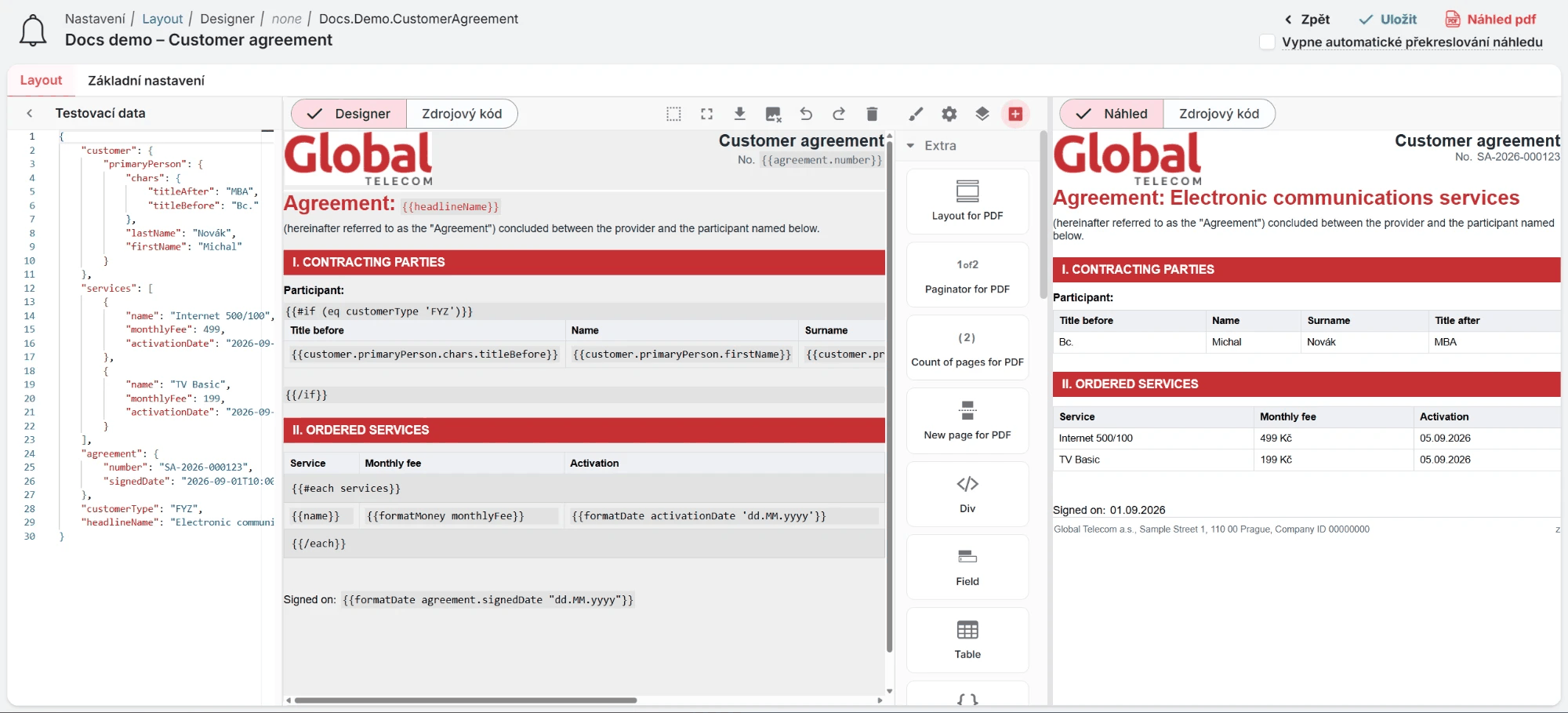
Screen layout
The Layout detail has two tabs:
- Layout – the editor itself.
- Basic settings – Code, Name, Form, Type, Formatter document type, Formatter document size, Labels and Configuration Type. The properties are described in Output Management.
The header shows the Code and Name, the Save button (also Ctrl+S) and a preview action that
depends on the document type:
| Document type | Action | What it does |
|---|---|---|
PDF | Preview pdf | Renders the Layout with the test data into a real PDF. Use it to check page size, margins, headers, footers and page breaks. |
EMAIL | Send a test email | Renders the Layout with the test data and sends it to the address you enter. Use it to check the result in real email clients. |
For a Layout of type HTML, the Layout tab has three panels. The side panels can be resized
and collapsed.
| Panel | Content |
|---|---|
| Test data (left) | A JSON editor with sample input data. The designer offers these values in the data pickers and uses them for the preview. |
| Designer / Source code (centre) | The visual canvas with the editor panels, or the HTML source of the Layout. Switch with the buttons at the top of the panel. SOURCE layouts have only the source code view. |
| Preview / Source code (right) | The Layout rendered by the server with the test data, or the rendered HTML. |
For a Layout of type FILE, the Layout tab shows the attachment area where you upload the
document file instead of the editor.
Live preview
The preview is rendered by the server with the same Handlebars engine that generates the real documents, so helpers and conditions behave as in production. It refreshes about one second after each change.
For large Layouts, turn on Disables automatic preview refresh in the header. The editor then stays responsive and the preview refreshes when you save or switch between the designer and the source code.
The preview panel shows HTML in the browser. The PDF is produced by a different rendering engine with its own fonts, page handling and print styles. Always confirm the final result with Preview pdf. See PDF and Email Layouts.
Test data
Paste a representative input JSON into Test data, ideally a real payload from the process or
notification that will use the Layout. The designer flattens it into dot paths such as
customer.primaryPerson.firstName and offers them in the Variable (testing data) pickers of the
Handlebars, Condition block and Signature components, together with the sample value.
Test data is stored on the Layout for design purposes only. It does not affect documents generated in production.
Designer
Toolbar
The toolbar above the editor panels contains these buttons, from left to right:
| Button | Action |
|---|---|
| View components | Shows dashed outlines of all components, so empty cells and wrappers are visible. |
| Fullscreen | Opens the editor in fullscreen mode. |
| Import | Opens the Import template dialog. The HTML you paste there replaces the whole content of the canvas. |
| Toggle images | Temporarily hides images in the canvas, which makes large Layouts faster to edit. Click again to show them. |
| Undo / Redo | Steps back or forward through your changes. |
| Clear canvas | Removes all content after a confirmation. |
The second group opens the side panel of the editor:
| Button | Panel |
|---|---|
| Style Manager (brush) | CSS properties of the selected component, see Styling components. |
| Settings (gear) | Properties (traits) of the selected component, for example the variable of a Handlebars component or the columns of a table. |
| Layer Manager | The component tree. Use it to select nested elements, reorder them and find hidden or empty ones. |
| Blocks (plus) | The block library. Drag a block onto the canvas to insert it. |
Keyboard shortcuts
| Shortcut | Action |
|---|---|
Ctrl+S | Save the Layout. |
Ctrl+Z / Ctrl+Shift+Z | Undo / redo. |
Ctrl+C / Ctrl+V | Copy / paste the selected component. |
Delete, Backspace | Delete the selected component. |
W / S | Select the previous / next sibling component. |
A / D | Select the parent / first child component. |
On macOS use ⌘ instead of Ctrl.
Block library
Drag blocks from the Blocks panel onto the canvas. The tSM components are in the Extra category.
Structure and content
| Block | Inserts |
|---|---|
| 1 Section, 1/2 Section, 1/3 Section, 3/7 Section | A table with one or two columns. Tables are the most reliable way to build columns in PDFs and emails. |
| Text, Text Section | Editable text. Double-click to edit; the text toolbar offers bold, italic, links, lists and indentation. |
| Image | An image. Customer logos are usually embedded as base64 data. |
| Button, Link, Link Block | Links styled as a button or text. |
| Divider, Quote, Grid Items, List Items | Prepared content blocks, mainly for emails. |
| Checkbox | A checkbox. Set whether it is checked in Settings. |
tSM components (Extra)
| Block | Available for | Purpose |
|---|---|---|
| Handlebars | all | A data placeholder, optionally with a formatting function. See Handlebars. |
| Field | all | A static label followed by a Handlebars value on one line, for example Customer ID: {{customer.id}}. |
| Condition block | all | Shows content conditionally or repeats it for each item of a list. See Condition block. |
| Table | all | A table with an optional header and footer that can repeat its body rows for each item of a list. See Table. |
| Signature | all | An image whose content comes from base64 data, for example a customer signature. |
| Div | all | An empty container for grouping content. |
| Custom Code | PDF | Raw HTML or Handlebars that the visual editor does not support. |
| Layout for PDF | PDF | The page frame with header, main content and footer, and the page margins. |
| Paginator for PDF | PDF | The current page number and the page count, for example 2 z 5. |
| Count of pages for PDF | PDF | The total number of pages. |
| New page for PDF | PDF | A forced page break. |
tSM components
Select a component on the canvas and open Settings (gear) to edit its properties.
Handlebars
The Handlebars component inserts one value into the document. Its settings have three parts:
- Variable (testing data) – a path from the test data, shown with its sample value, or Custom expression for anything the picker cannot express.
- Function – an optional helper applied to the value.
- Parameters – additional arguments for helpers that need them. For Format date you choose the date format instead.
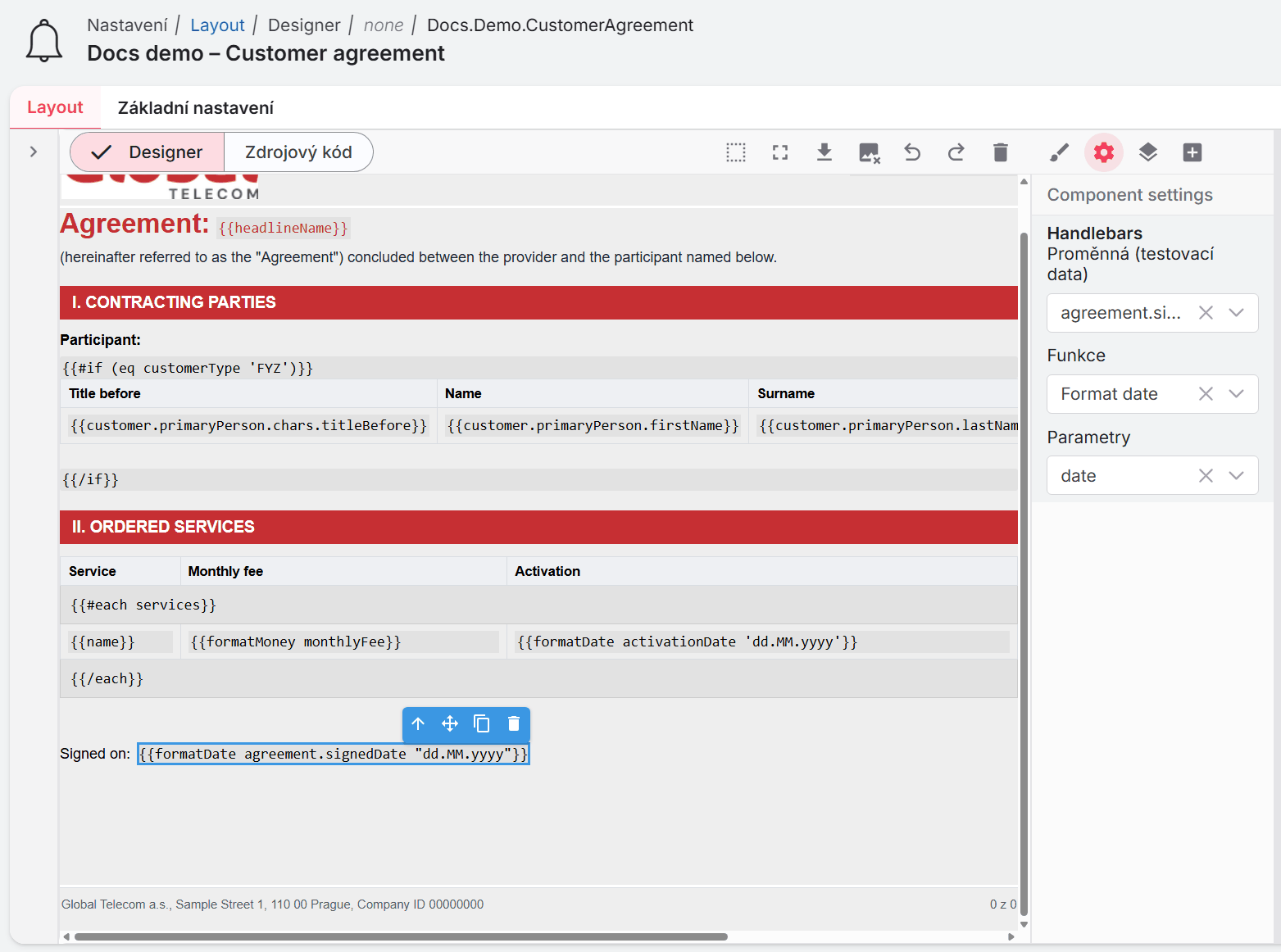
The component writes {{function variable parameters}}, for example
{{formatDate order.createdDate "dd.MM.yyyy"}}. A custom expression is written as is inside the
braces, so {description} produces {{{description}}}, which prints HTML without escaping.
| Function | Generated helper | Purpose |
|---|---|---|
| Plaintext | plaintext | Converts HTML to plain text. |
| Markdown | markdown | Converts Markdown to HTML. See the note below about triple braces. |
| HtmlToMarkdown | htmlToMarkdown | Converts HTML to Markdown. |
| Html | html | Outputs HTML without changes. |
| Format date | formatDate | Formats a date: dateTime (dd.MM.yyyy HH:mm), dateTimeS, dateTimeMs, date (dd.MM.yyyy), time (HH:mm), timeS. |
| Seconds time | secondsTime | Converts seconds to hours, minutes and seconds, for example 1:1:1 for 3661. |
| Format currency | formatCurrency | Older currency helper. For amounts use formatMoney as a custom expression, see the Handlebars Reference. |
| Math | math | Arithmetic, for example parameters "*" 1.21. |
| Replace, Replace regex | replace, replaceRegex | Replaces text or a regular expression match. |
| CheckBox text | checkBoxText | Renders a checkbox followed by text. |
| Button | button | Renders a link styled as a button. See the note below about triple braces. |
| User by Id, UserGroup by Id | userById, userGroupById | Prints the name of a user or user group. |
| Get ciselnik name by code | getCiselnikNameByCode | Prints the name of a user register value. The helper expects the register code first, so write it as a custom expression, see below. |
The helpers are described in the Handlebars Reference.
The component always writes double braces, so Markdown produces {{markdown body}} and the
generated HTML is escaped and printed as text. The same applies to Button. For formatted output
choose Custom expression and enter {markdown body}, which produces {{{markdown body}}}.
The component always writes the variable before the parameters. Get ciselnik name by code
needs the register code first, so write it as a custom expression, for example
getCiselnikNameByCode 'Prostredi' order.environment.
Helpers that are not in the list, such as formatMoney or spel, are available through
Custom expression as well, for example formatMoney order.total currency='EUR'.
Field
The Field component is a label and a Handlebars value that stay on one line. Edit the label text
directly on the canvas and select the value to set its variable. Use Field for pairs such as
Order number: {{order.key}}. Suffixes such as a currency or a unit belong in a separate text
element next to the Field.
Condition block
The Condition block wraps content in a Handlebars block. Its settings are Function and Parameters (the condition or the list path):
| Function | Generated markup | Use |
|---|---|---|
| If | {{#if condition}} … {{/if}} | Show the content only when the condition is true. |
| If-else | {{#if condition}} … {{else}} … {{/if}} | Show one of two variants. |
| Each | {{#each list}} … {{/each}} | Repeat the content for each item of a list. Inside, paths are relative to the item. |
| With | {{#with object}} … {{/with}} | Shorten paths inside the block to the given object. |
The designer shows the start, else and end markers as small labelled bars, so you can see where
the block begins and ends. They are part of the HTML, so hide them in print output with
@media print { .start-condition, .if-else-condition, .end-condition { display: none; } } when they
break inline layouts in the PDF.
Conditions can use any helper from the Handlebars Reference:
A condition such as contract.isAmendment true is not a comparison: the second word is passed as an
extra argument and the condition only tests contract.isAmendment. Use (eq a b) or
(ifEquals a b) whenever you compare two values.
Table
The Table component builds a table whose rows can be generated from a list. Its settings:
| Setting | Meaning |
|---|---|
| Number of Rows, Number of Columns | Size of the table body. |
| Table Header, Table Footer | Adds a <thead> or <tfoot> row. A PDF repeats the header on every page the table spans. |
| Each Cell | Repeats the body rows for each item of a list. |
| Array parameter | The list path for Each Cell, for example order.items. |
With Each Cell turned on, the table gets two technical rows with {{#each order.items}} and
{{/each}}. Keep them: they are hidden in the output and define what is repeated. Inside the body
rows, bind cells to item properties such as {{name}} and {{price}}.
The result looks like this in the source code:
<table class="table-plugin" eachcell="true" eachparametercell="order.items">
  <thead class="table-header-plugin">
    <tr><th class="table-cell-th-plugin">Item</th><th class="table-cell-th-plugin">Price</th></tr>
  </thead>
  <tbody class="table-body-plugin">
    <tr class="table-body-each-start-plugin"><td>{{#each order.items}}</td></tr>
    <tr>
      <td class="table-cell-plugin">{{name}}</td>
      <td class="table-cell-plugin">{{formatMoney price}}</td>
    </tr>
    <tr class="table-body-each-end-plugin"><td>{{/each}}</td></tr>
  </tbody>
</table>
Signature
The Signature component shows an image from base64 data. Choose the variable that contains the
image data (for example a signature captured in a form). The component writes
src="data:image/png;base64,{{variable}}" for you, so the variable must contain only the base64
content without the data: prefix. Functions are not offered, because any formatting would corrupt
the image data.
Layout for PDF
Layout for PDF is the page frame of a PDF document. Every PDF Layout should start with it. It contains three fixed areas:
| Area | Content |
|---|---|
| Header | Content printed at the top of each page, for example a logo and the document title. |
| Main | The document body. |
| Footer | Content printed at the bottom of each page, for example company details and the paginator. |
Its settings are the page margins margintop, marginright, marginbottom and
marginleft (defaults 150px, 1cm, 100px, 1cm). The top and bottom margins must leave
enough space for the header and the footer. The paper size is taken from Formatter document size
in Basic settings.
Whether the header and footer repeat on every page depends on the PDF rendering engine of the environment, see Running header and footer.
Paginator for PDF and Count of pages for PDF are filled in when the PDF is generated. In the designer they stay empty. New page for PDF forces a page break; use it only where the document really requires a new page, otherwise let the content flow.
Custom Code
For PDF Layouts, Custom Code holds HTML or Handlebars that the visual editor cannot model,
for example inline Handlebars inside a numbered list. Open the code editor from the component
toolbar, edit the code and click Save. Scripts are not executed in the canvas.
Styling components
The Style Manager edits the CSS of the selected component:
| Sector | Properties |
|---|---|
| Dimension | Width, height, maximum width, minimum height, margin, padding, and the display mode (Block, Inline block, Inline). |
| Typography | Font family, size, weight, letter spacing, colour, line height, alignment, decoration, style, vertical alignment, text shadow and white space handling. |
| Decorations | Background, border radius, borders, border collapsing and background images. |
The editor styles the selected component by its own ID. This keeps styles independent of each other: changing one cell does not change other cells. Styles defined in the source code with classes still apply and can be combined with the per-component styles.
Source code
Switch the centre panel to Source code to edit the HTML directly. This is useful for:
- pasting a Layout prepared outside tSM,
- Handlebars constructs the designer does not model, such as whitespace control or nested helpers,
- bulk edits such as renaming a data path in all places.
For PDF Layouts, the source starts with a generated block marked
IMPORTANT - this block do not edit!!!. It holds the @page rule and the print rules and is
regenerated from Layout for PDF and Formatter document size on every export, so change the
margins and the paper size there, not in this block.
When you switch back to Designer, the source is parsed into components again. Keep the tSM
components intact in the source: the class names (table-plugin, condition-block,
layout-wrapper-pdf, …) and attributes (eachcell, function, condition, customexpression)
are how the designer recognises them.
Worked example: customer agreement
This example builds the Participant section of a contract.
-
In Basic settings, set Formatter document type to
PDFand Formatter document size toA4. -
Paste test data, for example:
{
  "headlineName": "Electronic communications services",
  "customerType": "FYZ",
  "customer": {
    "primaryPerson": {
      "firstName": "Michal",
      "lastName": "Novák",
      "chars": { "titleBefore": "Bc.", "titleAfter": "MBA" }
    }
  }
} -
Insert Layout for PDF. Put the logo into the header and a Paginator for PDF into the footer.
-
In the main area, add a heading with a Field
Agreement: {{headlineName}}. -
Add a Condition block with the function If and the condition
(eq customerType "FYZ"), so the next part appears only for individuals. -
Inside it, insert a Table with a header and four columns (Title before, Name, Surname, Title after). Put Handlebars components into the body cells and choose the variables
customer.primaryPerson.chars.titleBefore,customer.primaryPerson.firstName, and so on. -
Check the live preview, then click Preview pdf and review the real PDF.
-
Save the Layout.
The resulting source of the conditional table:
Best practices
- Start from real data. Test data copied from a real process makes the pickers accurate and the preview trustworthy.
- Build columns with tables. Section blocks and tables render consistently in PDF engines and email clients; floating or flex layouts often do not.
- Use the tSM components for data, conditions and repeating rows instead of hand-written Handlebars in text. They keep start and end markers in sync.
- Check the real output. The preview is HTML in a browser. Confirm PDFs with Preview pdf and emails with Send a test email.
- Move content to Templates. Texts that business users change belong in a Template, not in the Layout.
For print and email specifics, continue with PDF and Email Layouts.